Overview
I love bringing people together, and on campus that should be easy. In practice events get lost in group chats, flyers, and word of mouth. If you are new, or just not in the right chat, you miss things.
Clubs feel it from the other side. They plan something great and half the people who would love it never hear about it.
I kept hearing about great events the day after they happened. Flyers on doors and posts in group chats were easy to miss, and the clubs doing the work deserved a bigger crowd. I wanted one place where any student could see what is on tonight and say yes in one tap.
So I built Campus Events: see what is on tonight, RSVP in a tap, carry your ticket in your pocket. If you run a club, create an event, get it approved, and scan people in at the door. v1 was a working web app I built in September. Then I audited it and redesigned the whole thing, from Oct 3 to 9, as v2.
What I made
v2 covers the whole life of an event, for the people going and the people running it.
THE FLOW
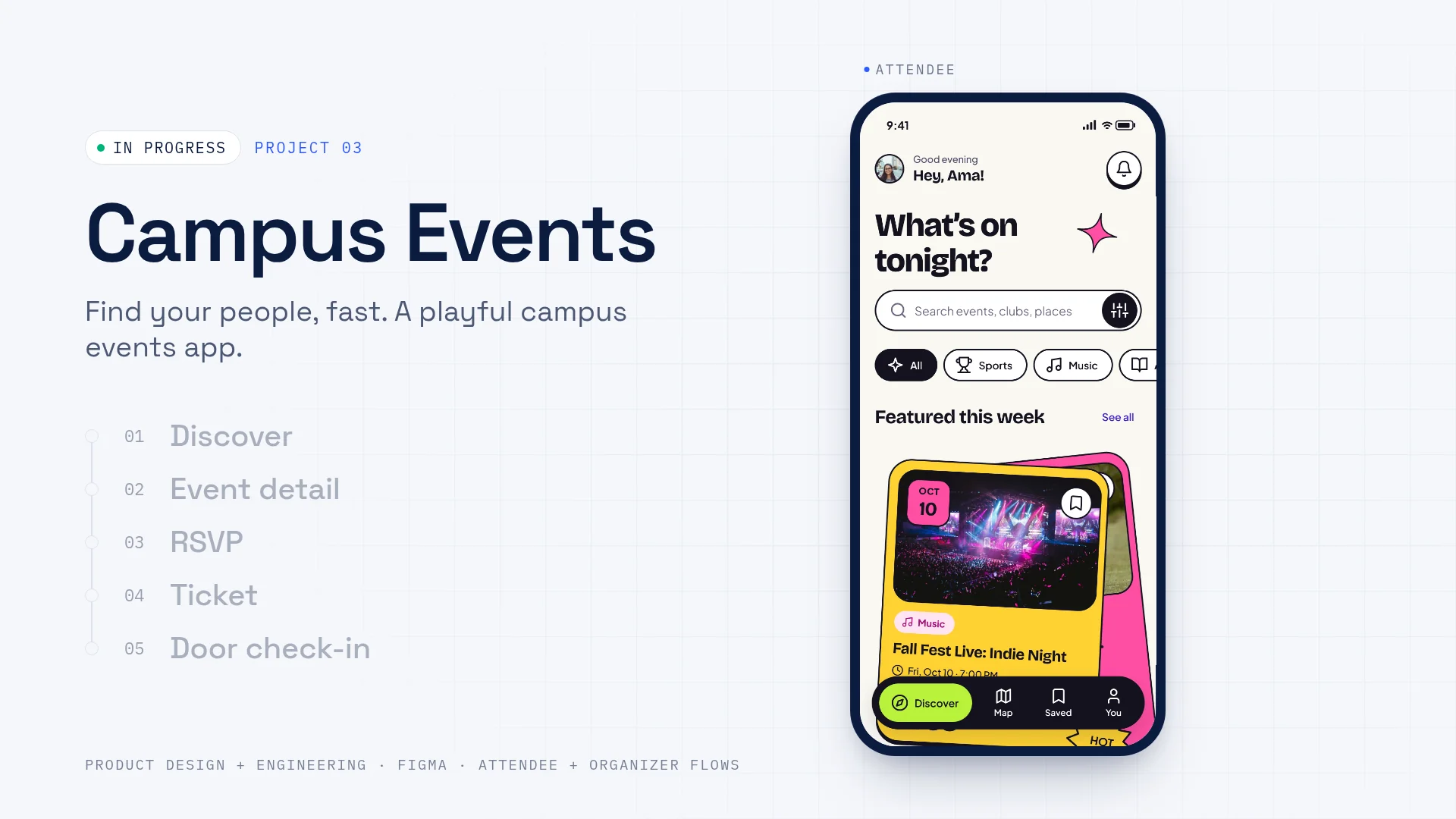
Attendees get onboarding, a Discover feed, event pages with real RSVP states, a QR ticket, a map, and saved events. Organizers get a dashboard, an eight-step create flow, an approval step, a door scanner, and tools to edit, postpone, or cancel. There are screens for when things go wrong too: offline, could not load, time changed, cancelled. About 59 mobile screens in all, and a prototype with 9 named flows.
The names, numbers, and places in the screens (like "Campus Radio 89.1," "1,284 RSVPs this month," and "Main Quad Stage") are sample content, not real data. When I build it I will use real Livingstone places and orgs, like Varick Auditorium and the Blue Bears.
Decisions
DECISION 01
I audited my own v1 before redesigning it
v1 worked. It was a real web app with a warm editorial look. But working and ready are different things, so I went through it looking for what was wrong.
WHAT THE AUDIT FOUND
- →Much of the small text (dates, tags, venues, nav labels) was 8 to 10 px.
- →Two grey text colors failed contrast, at 3.48:1 and 2.68:1 on white.
- →The bookmark on list cards was 24 by 32, and map controls were under 44 px.
- →No components, no variables, no text styles, and more than 20 corner radii.
- →Two Profile screens, three date formats, and no event page, even though every card pointed to one.
I could have patched each screen. Instead I rebuilt the foundation first: color tokens, 14 named text styles with nothing under 12 px, and 44 px minimum targets. Then I redesigned on top of it.
If I am going to build this, every inconsistency in the design becomes a bug in the code. Fixing it once at the system level beats fixing it screen by screen forever.
DECISION 02
Playful, but never at the cost of reading it
I wanted the app to feel like a campus night out, loud and fun. But playful interfaces break the basics all the time: neon on neon, tiny labels, meaning carried by color alone.
So big color blocks carry the mood and the type stays calm. Every text pair is measured on a foundations sheet. Ink on lime is 13.91:1. White on pink came in at 3.04:1, so it is marked NOT USED. Characters only show up in emotional moments like onboarding, empty states, and errors, never in the middle of a task.
Fun is the reason people open the app. Readability is the reason they can use it. Measuring contrast let me push the color without guessing.
DECISION 03
Design the awkward moments
A feed of events is the easy part. The real experience is what happens when an event fills up, when the time changes, when it is cancelled, and what the organizer needs at the door.
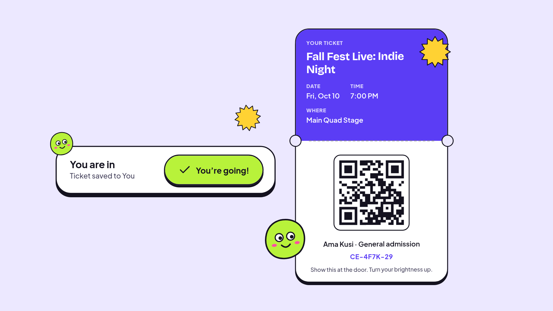
The RSVP button always says what is true: "Free, 184 spots left." "You are in, ticket saved to You." "Event full, 12 people on the waitlist." "You are #4, we will notify you." A cancelled event says exactly what it means for you: "Your RSVP was removed, nothing else to do." Organizers get a door scanner that says plainly when someone is checked in and when a ticket is invalid.
Trust is built in the awkward moments. If the app is honest when an event is full or cancelled, people will believe it when it says "You are going."
Looking back
My first version taught me more after I audited it.
Seeing 8 px text and failing contrast in my own work made those rules stick.
The organizer is a user too.
v1 only thought about attendees. Designing the door scanner and the approval flow changed how I see the whole product.
I lost something in the redesign.
v1 was full of real Livingstone places. v2 uses generic sample content. Putting my campus back is the next thing I would fix.
There are no users yet, so no numbers. What it shows today is that I can take my own working first version, find what is wrong with it, and turn it into something complete enough to hand to engineering, which in this case is me.
NEXT
- 01Bring real Livingstone venues, orgs, and the Blue Bears back into the sample content.
- 02Build v2 in code, starting with Discover, event page, and RSVP.
- 03Show it to five students and two club leaders and watch them RSVP and post an event.